Everything You Need to Know About Sprint Burndown Chart
Scrum has been widely implemented in many organizations as it is one of the easiest frameworks to understand in Agile Methodology. With the growing use of Scrum, it becomes essential for professionals to understand various Scrum Artifacts, which are tools used by the Scrum Team to help them develop and deliver products efficiently. One of the important Scrum Artifacts which any professional should know about is the Sprint Burndown chart. A Sprint Burndown chart is not an official Scrum artifact but many teams use it to communicate and track progress toward the Sprint Goal during the Sprint. This is used in various Agile methodologies where work has to be measured concerning time. It is a must-have for Scrum Teams as it helps them to monitor product scope creep and keep them running on a schedule during the Sprint. It also helps the team to compare planned tasks with the team progression. In Scrum, there are two types of Burndown charts which are the Sprint Burndown chart and the release burndown chart. This article mainly focuses on the Sprint Burndown chart.
What is a Sprint Burndown Chart?
A Sprint Burndown Chart is a graphical representation that displays the rate at which work is done and how much work is yet to be done. It is used as a tool to make the team work visible for everyone and transparent. As the Sprint progresses, the line of the chart begins to slope downwards indicating the completion of the work across story points and over Sprint duration completed. It mainly shows the team progress towards a specific Sprint goal by taking the amount of work remaining into account and not the time spent by the Developers. The downward sloping of the burndown chart indicates that the work remaining in the Sprint is reducing and will reach the x-axis when the work is fully completed.
As they say that a picture can depict a thousand words, the burndown chart can effectively convey the information that a thousand words may not. Essentially, the burndown chart shows how the team is working through the customer User Stories and determines the total effort versus the amount of work in each iteration. The vertical axis in the chart represents the quantity of work remaining and the horizontal axis shows the time that has passed since the beginning of the Sprint. The Sprint Burndown Chart is updated regularly so that it is accurate and is displayed so that all the team members can look at it.
Why use the Sprint Burndown Chart?
The Scrum Team is self-managing, and self-directing itself so that they are successful in their product development. A Sprint Burndown Chart would make the team work visible and would help them see where exactly they stand. During the Sprint Planning, the team cannot define the list of work required to build, design, test, and integrate the items on the Product Backlog on the Sprint. As the team proceeds with the Sprint, they may realize that a particular task is needed in this Sprint to complete the required Product Backlog item. The team need not wait for the next Sprint to add the item; the items could be added on the Sprint Backlog directly and get their work done. As they understand the work better, more of such situations may arise. The burndown chart records how much of the work is completed by the team and does not specifically see the number of smaller tasks required for the work. This shows how efficient the team is to complete the work that they had promised before the Sprint. To summarize, Sprint Burndown Charts help the team to assess the number of tasks remaining in the Sprint Backlog and also display the amount of time they took to complete the task. This helps the stakeholders and other members to predict the time when the goals of the Sprint would be completed.
Participants of Sprint Burndown Chart
The Scrum Team actively leverages the Sprint Burndown Chart. The Developers update the Sprint Burndown chart and make the Sprint work visible for the stakeholders. The release plan is updated by the Product Owner by looking at the burndown chart. The Developers are coached and supported by the Scrum Master who reminds them to follow the Scrum values and principles. When a Sprint begins, the team utilizes the burndown chart vigorously and reports the effort that is estimated for every incomplete task. This should also imply that the total work should also decrease and the number of incomplete tasks should reduce.
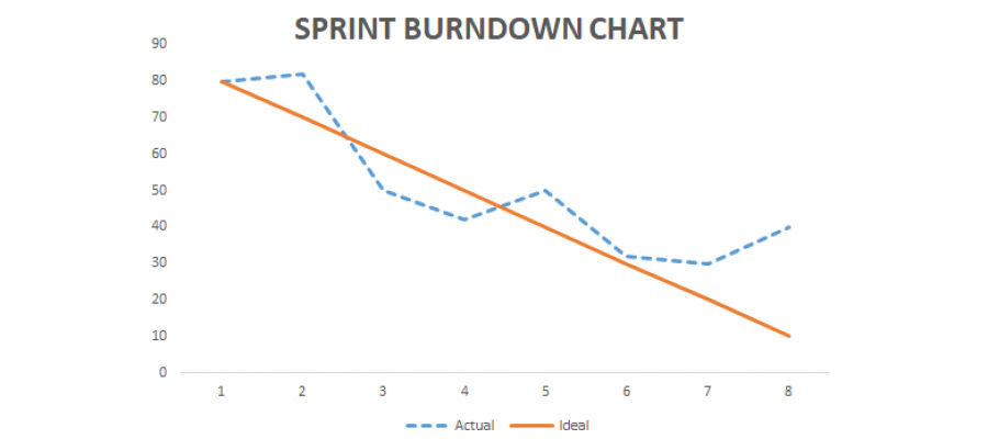
Depiction of a Sprint Burndown Chart
The total hours spent: The burndown chart depicts the estimated work hours to complete User Stories and other Product Increments that were committed by the team initially at Sprint Planning.
Amount of effort remaining in the Sprint: The main purpose of the burndown chart to depict the remaining effort the team has to put in to complete the Sprint. Ideally, a successful Sprint would not have any work effort at the end of the Sprint.
The number of days working: This information is crucial for the team to approximate and work efficiently such that they can segregate the work for every day. This is the same as the duration of the Sprint.
Ideal Effort: It is the effort that is calculated by assessing the quantity of remaining effort that has to be completed in the Sprint. This is a point of reference for the team which is why it is a vertical line from the Y-axis to the X-axis.
Real Effort: It is the line that shows the remaining effort which differs every day across teams. It entirely depends on the remaining effort at the end of each day which the team members have to put in to complete the tasks. The line comes down on finishing the task every day and for example, if more tasks are added to the Sprint, there would be an upward progression (spike) in the line.
Reading a Sprint Burndown Chart
The work required to complete the entire task is assessed by the team at the beginning of the iteration. The line of the graph would tell the team that if everything is going according to the plan. If the line moves downwards every day, then the work pace is good. However, if the slope does not go downwards it is time to pace up the work and put in more effort so that the line reaches the end of the x-axis when the Sprint ends.
There could be three situations that a team may face while reading a Sprint Burndown Chart. They are:
The trend line touches the x-axis when the team is near the Sprint end, then the team has finished the tasks on Sprint Backlog on time.
If the trend line touches left to the x-axis concerning the ideal line, then the work is completed earlier on the Sprint, and more work could be added to the Sprint Backlog.
If the trend line touches the right side, then the team is late in completing the tasks which are because they have taken more work than they could complete or they are not following up the work taken consistently. At this phase, the team should analyze what is the reason they are late and try to rectify it in the next Sprint.
Hence, the trend lines show how well the team flow is managed during the Sprint. The team can also answer these questions:
How efficiently can the team conduct Sprint Planning?
Is the team performing well with the stories that were chosen at the Sprint Planning?
Does the team show unity and work together by being self-managed?
What are the refinements that this team could do?
What are the advantages of Sprint Burndown Charts?
Tracking and planning perfectly: The chart helps the team to evaluate the effort remaining and estimated effort and also breaks down the tasks that have to be completed.
Reduction of Risk: As the chart shows the visual depiction of the effort and time, there are fewer chances of running into risks. The charts alert the team quickly if they are not putting in enough effort and rather than waiting till the team, the team could start anticipating beforehand and work towards finishing the tasks.
Communication is smooth and effective: As the chart provides transparency and updates the progress every day, the team can effectively discuss ways to be consistent and also identify the issue that is causing the delay.
Common Mistakes while using Sprint Burndown Charts
Not arranging the points on the graph that shows the remaining and effort spent values correctly causes inaccuracy in the report leaving an error during the Sprint.
Not updating the burndown chart leads to the data is invalid.
Overestimating tasks and taking bigger tasks that cannot be fit inside a Sprint leads to tough to track the progress of the product.
Limitations of the Burndown chart
The chart does not show everything which is required for the team to track progress. It only shows the number of story points completed and does not account for any changes in the scope of work.
This makes it difficult for the team to understand whether the changes in the chart are because of Backlog items completed or because of an increase or decrease in story points.
It does not show which Product Backlog item has been completed, hence, the team can see progress but cannot estimate whether they are heading in the right direction to achieve the Sprint goal.
Ideal work is estimated by the team which could be inaccurate. If the team overestimates the ideal work and time, then the work appears ahead of the schedule, but if they underestimate, it appears that they are behind schedule.
If the team could incorporate an efficiency factor into the Burndown Chart, the estimate could be better and accurate ideal work and time could be calculated.
Conclusion
Overall, the Sprint Burndown Chart is a tool that motivates the team members to get the work done. It helps them to keep the time and effort on track and helps them estimate how much of the work is required to complete the Sprint Goal. It also helps the Developers to identify their progress and also if there is any obstacle they are facing in the early stages rather than at the end. This gives the team members time to adapt to changes earlier at every Sprint and makes each consecutive Sprint successful. The Burndown Chart could also teach the team to estimate accurately what they can achieve in a Sprint and whether any task has to be broken down into two or more Sprints.
References
- https://www.scruminc.com/Sprint-burndown-chart/
- https://www.visual-paradigm.com/scrum/scrum-burndown-chart/
- https://www.projectmanager.com/blog/burndown-chart-what-is-it
Useful Links:
Advanced Product Owner Virtual Certification Training Perth, Certified Scrum Product Owner Certification Training Fort Smith, A-CSPO Certification Course Charleston, Leading SAFe Online Training Corpus Christi, Advanced-CSM Course, What Are The Skills Required To Be A Successful Scrummaster?, SAFe Agilist Course Abu Dhabi, Advanced-CSM Online Certification Tokyo, Sprint Planning Best Practices, SAFe Agilist Online Training Oklahoma City


